Sociodemographic Associated with HIV Infection from 1999 to 2016
Data Sources
The National Health and Nutrition Examination Survey is designed to evaluate the health and nutritional status of both adults and children. In 1999, the NHANES study transitioned into a continuous format, enabling investigators to conduct longitudinal studies. NHANES encompasses both interview data and physical examination data, which involved information from different perspectives and fields, providing researchers with a comprehensive dataset to examine the prevalence and risk factors associated with various diseases. In this study, we used the demographic data, HIV testing, and sexual behavior data from 1999 to 2016 to identify the potential sociodemographic factors associated with HIV infection status.
Study Objectives
Our study’s primary objective is to analyze the NHANES dataset from 1999 to 2016 to identify sociodemographic factors associated with HIV infection rates in the United States. By examining variables such as age, gender, race, education level, and marial status, we aim to illuminate the complex interplay of societal elements influencing HIV prevalence. This analysis will provide valuable insights into the demographics most affected by HIV, guiding public health strategies and resource allocation to improve prevention and treatment programs. Through this research, we seek to contribute to a more nuanced understanding of HIV epidemiology that could underpin targeted interventions and support the reduction of infection disparities across diverse population groups.
Data Cleaning
Libraries and Variables
We will load the following libraries for utilization this section:
haventidyversepurrrplotlymodelr
The following variables are included in the analysis:
seqn: sequencelbdhi/lbxhivc: HIV test resultsridageyr: ageriagendr: genderridreth1: racexdmdeduc2: educationdmdmartl: martial statussxq220/sxq550: In the past 12 months, with how many men have you had anal or oral sex? (Only to men)sxq150/sxq490: In the past 12 months, with how many women have you had anal or oral sex? (Only to women)
import NHANES datafiles
The analyzed data sets was downloaded from the National Health and Nutrition Examination Survey Website. Specifically, demographic, HIV test, and sexual behavior datas from 1999 to 2016 utilized to conducted the analysis. Participants aged between 20 and 49 with a completed survey were eligible and included to our study.
demo_list =
  list.files(path = "NHANES/DEMO", full.names = TRUE)
hiv_list =
  list.files(path = "NHANES/HIV", full.names = TRUE)
sxq_list =
  list.files(path = "NHANES/SXQ", full.names = TRUE)


load_files = function(x){

  filetype =
    str_extract(x, "DEMO|HIV|SXQ")

  year =
    str_extract(x, "(?<=_)[A-Z]")

data =
    read_xpt(x) |>
    janitor::clean_names()|>
    mutate(filetype = filetype, year = year)

}


demo_list_output =
  map(demo_list, load_files)

hiv_list_output =
  map(hiv_list, load_files)

sxq_list_output =
  map(sxq_list, load_files)

join_pair = function(df1, df2) {
  left_join(df1, df2, by = c("seqn", "year"))
}


hiv_demo_list =
  map2(hiv_list_output, demo_list_output, ~join_pair(.x, .y))

hiv_demo_sxq_df =
  map2(hiv_demo_list, sxq_list_output, ~join_pair(.x, .y)) |>
  bind_rows()

cleaned_joined_df =
  hiv_demo_sxq_df |>
  filter(ridageyr >= 20 & ridageyr <= 49) |>
  mutate(hiv = case_when(
    lbdhi == 1 | lbxhivc == 1 ~ 1,
    lbdhi == 2 | lbxhivc == 2 ~ 2)
    )|>
  mutate(MSM = case_when(
    year %in% c("A","B","C") ~ sxq220,
    year %in% c("D","E","F","G","H","I") ~ sxq550)
    )|>
   mutate(WSW = case_when(
    year %in% c("A","B","C") ~ sxq150,
    year %in% c("D","E","F","G","H","I") ~ sxq490)
    )|>
  mutate(year = recode(year,
                       "A" = "1999-2000",
                       "B" = "2001-2002",
                       "C" = "2003-2004",
                       "D" = "2005-2006",
                       "E" = "2007-2008",
                       "F" = "2009-2010",
                       "G" = "2011-2012",
                       "H" = "2013-2014",
                       "I" = "2015-2016"),
         hiv = recode(hiv,
                            "1" = "Reactive",
                            "2" = "Non-reactive"),
         gender = recode(riagendr,
                         "1" = "Male",
                         "2" = "Female"),
         age = ridageyr,
         race = recode(ridreth1,
                       "1" = "Mexican American",
                       "2" = "Other Hispanic",
                       "3" = "Non-Hispanic White",
                       "4" = "Non-Hispanic Black",
                       "5" = "Other Race - Including Multi-Racial"),
         education = recode(dmdeduc2,
                            "1" = "Less than 9th grade",
                            "2" = "9-11th grade",
                            "3" = "High school graduate or equivalent",
                            "4" = "Some college or AA degree",
                            "5" = "College graduate or above",
                            "7" = NA_character_,
                            "9" = NA_character_),
         marriage = recode(dmdmartl,
                           "1" = "Married",
                           "2" = "Widowed",
                           "3" = "Divorced",
                           "4" = "Separated",
                           "5" = "Never married",
                           "6" = "Living with partner",
                           "77" = NA_character_,
                           "99" = NA_character_)
         ) |>
  mutate(samesexcontact = case_when(
    (MSM %in% c(0, 7777, 77777,9999, 99999) | WSW %in% c(0, 7777, 77777, 9999, 99999)) ~ 0,
    (MSM >= 1 & MSM <= 600) | (WSW >= 1 & WSW <= 600) ~ 1
  )) |>
  select(seqn, hiv, age, gender, race, education, marriage, year, samesexcontact)
Descriptive visualization of the potential risk factors
To visualize the association between the selected potential risk factors and HIV test results, we specifically calculated the percent of participants whose HIV-antibody test showing (lbdhi or lbxhivc) ‘positive’ among all the participants who reported to have a ‘positive’ or ‘negative’ value in the antibody test. We further excluded the participants whose status is ‘missing’ or ‘indeterminate’ in the antibody test in our data visualization section.
Then, we plot each bar chart illustrating the integrated (from 1999 to 2016) percentage of ‘positive’ participants on the y-axis and the risk factor of interest on the x-axis, correlated with a line plot indicating the change of the ‘positive’ participants for each risk factor to assess the association between HIV and each risk factor in a rough way. Besides, the mean age of the positive clusters among each sub-cohort was also calculated for each characteristic/risk factor.
Write a function to combine bar and line plot
We firstly wrote a function for creating the combined plot for each risk factor.
combine_plot = function(bar, line, indicator){
  title_g = paste("Percent of HIV-Antibody Positive Patients from 1999 to 2016 by", indicator)

  combine_bar =
    subplot(bar, line, margin = 0.1) %>%
    layout(title = title_g)

  annotations = list(
  list(
    x = 0.17,
    y = 0.98,
    text = "Total Percent",
    xref = "paper",
    yref = "paper",
    xanchor = "center",
    yanchor = "bottom",
    showarrow = FALSE
  ),
  list(
    x = 0.86,
    y = 0.98,
    text = "Percent by Year",
    xref = "paper",
    yref = "paper",
    xanchor = "center",
    yanchor = "bottom",
    showarrow = FALSE
  ))

  combine_bar = combine_bar %>%
  layout(annotations = annotations)

}
Race and the Percent of ‘Positive’ in HIV Antibody Test
bar_race =
  cleaned_joined_df %>%
  drop_na(hiv) %>%
  group_by(race) %>%
  summarize(total_par = n(),
            age_mean = round(mean(age[hiv == "Reactive"]), 2),
            hiv_percent = round(sum(hiv == "Reactive") / total_par * 100, 3)) %>%
  ungroup() %>%
  mutate(race = fct_reorder(race, hiv_percent)) %>%
  mutate(text_label = str_c("mean age: ", age_mean, ", Positive HIV Percent: ", hiv_percent, "%")) %>%
  plot_ly(x = ~race, y = ~hiv_percent, color = ~race, type = "bar", text = ~text_label)

line_race =
  cleaned_joined_df %>%
  drop_na(hiv) %>%
  group_by(year, race) %>%
  summarize(total_par = n(),
            age_mean = round(mean(age[hiv == "Reactive"]), 2),
            hiv_percent = round(sum(hiv == "Reactive") / total_par * 100, 3)) %>%
  ungroup() %>%
  mutate(race = fct_reorder(race, hiv_percent)) %>%
  mutate(text_label = str_c("mean age: ", age_mean, ", Positive HIV Percent: ", hiv_percent, "%")) %>%
  plot_ly(x = ~year, y = ~hiv_percent, color = ~race, type = "scatter", mode = "lines+markers",
          text = ~text_label)


combine_race = combine_plot(bar_race, line_race, "Race")

combine_race
The bar plot displays the percentage of patients with a positive result from the HIV antibody test for each racial group when we integrated all datasets from 1999 to 2016. It indicates that the Non-Hispanic Black race reported the highest percentage, while the ‘Other Race’ had the lowest percentage. This bar plot highlights disparities among the races. The line plot illustrates the change in the reported positive percentage of HIV antibody tests from 1999 to 2016. We can observe that the trends in each racial group are different, with Non-Hispanic Black and Other Hispanic showing a decreasing trend over this period. From the two plots, it is evident that the mean age varies for each race and each year were also different.
Sex and the Percent of ‘Positive’ in HIV Antibody Test
bar_gender =
  cleaned_joined_df %>%
  drop_na(hiv) %>%
  group_by(gender) %>%
  summarize(total_par = n(),
            age_mean = round(mean(age[hiv == "Reactive"]), 2),
            hiv_percent = round(sum(hiv == "Reactive") / total_par * 100, 3)) %>%
  ungroup() %>%
  mutate(text_label = str_c("mean age: ", age_mean, ", Positive HIV Percent: ", hiv_percent, "%")) %>%
  plot_ly(x = ~gender, y = ~hiv_percent, color = ~gender, type = "bar", text = ~text_label)


line_gender =
  cleaned_joined_df %>%
  drop_na(hiv) %>%
  group_by(year, gender) %>%
  summarize(total_par = n(),
            age_mean = round(mean(age[hiv == "Reactive"]), 2),
            hiv_percent = round(sum(hiv == "Reactive") / total_par * 100, 3)) %>%
  ungroup() %>%
  mutate(text_label = str_c("mean age: ", age_mean, ", Positive HIV Percent: ", hiv_percent, "%")) %>%
  plot_ly(x = ~year, y = ~hiv_percent, color = ~gender, type = "scatter", mode = "lines+markers",
          text = ~text_label)

combine_gender = combine_plot(bar_gender, line_gender, "Gender")
combine_gender
Both the bar plot and the line plot indicate that males have reported a significantly higher percentage than females. Furthermore, the line plot reveals a decreasing trend in positive percentages for both sex. From the two plots, it is evident that the mean age in females appears to be slightly higher that among males among patients with a positive test result.
Education Level and the Percent of ‘Positive’ in HIV Antibody Test
bar_edu =
cleaned_joined_df %>%
  drop_na(hiv) %>%
  group_by(education) %>%
  summarize(total_par = n(),
            age_mean = round(mean(age[hiv == "Reactive"]), 2),
            hiv_percent = round(sum(hiv == "Reactive") / total_par * 100, 3)) %>%
  ungroup() %>%
  mutate(education = forcats::fct_relevel(education, c("Less than 9th grade", "9-11th grade",
                                         "High school graduate or equivalent",
                                         "Some college or AA degree",
                                         "College graduate or above"))) %>%
  mutate(text_label = str_c("mean age: ", age_mean, ", Positive HIV Percent: ", hiv_percent, "%")) %>%
  plot_ly(x = ~education, y = ~hiv_percent, color = ~education, type = "bar", text = ~text_label)


line_edu =
  cleaned_joined_df %>%
  drop_na(hiv) %>%
  group_by(year, education) %>%
  summarize(total_par = n(),
            age_mean = round(mean(age[hiv == "Reactive"]), 2),
            hiv_percent = round(sum(hiv == "Reactive") / total_par * 100, 3)) %>%
  ungroup() %>%
  mutate(education = forcats::fct_relevel(education, c("Less than 9th grade", "9-11th grade",
                                         "High school graduate or equivalent",
                                         "Some college or AA degree",
                                         "College graduate or above"))) %>%
  mutate(text_label = str_c("mean age: ", age_mean, ", Positive HIV Percent: ", hiv_percent, "%")) %>%
  plot_ly(x = ~year, y = ~hiv_percent, color = ~education, type = "scatter", mode = "lines+markers",
          text = ~text_label)


combine_edu = combine_plot(bar_edu, line_edu, "Education")
combine_edu
The bar plot indicates that the group with an education level of ‘9-11th grade’ has reported the highest percentage, while ‘College graduate or above’ had the lowest percentage. Disparity among education levels was also observed. From the line plot, the trends from 1999 to 2016 in each education level are distinct, but with an overall decreasing trend. These two plots also indicate that the mean age varies for each race and each year, and the overall trend is unclear.
Marital status and the Percent of ‘Positive’ in HIV Antibody Test
bar_mar =
  cleaned_joined_df %>%
  drop_na(hiv) %>%
  group_by(marriage) %>%
  summarize(total_par = n(),
            age_mean = round(mean(age[hiv == "Reactive"]), 2),
            hiv_percent = round(sum(hiv == "Reactive") / total_par * 100, 3)) %>%
  ungroup() %>%
  mutate(marriage = fct_reorder(marriage, hiv_percent)) %>%
  mutate(text_label = str_c("mean age: ", age_mean, ", Positive HIV Percent: ", hiv_percent, "%")) %>%
  plot_ly(x = ~marriage, y = ~hiv_percent, color = ~marriage, type = "bar", text = ~text_label)


line_mar =
  cleaned_joined_df %>%
  drop_na(hiv, marriage) %>%
  group_by(year, marriage) %>%
  summarize(total_par = n(),
            age_mean = round(mean(age[hiv == "Reactive"]), 2),
            hiv_percent = round(sum(hiv == "Reactive") / total_par * 100, 3)) %>%
  ungroup() %>%
  mutate(marriage = fct_reorder(marriage, hiv_percent)) %>%
  mutate(text_label = str_c("mean age: ", age_mean, ", Positive HIV Percent: ", hiv_percent, "%")) %>%
  plot_ly(x = ~year, y = ~hiv_percent, color = ~marriage, type = "scatter", mode = "lines+markers",
          text = ~text_label)

combine_mar = combine_plot(bar_mar, line_mar, "Marital Status")
combine_mar
The bar plot shows that ‘widowed’ individuals have reported the highest percentage, while ‘married’ individuals had the lowest percentage. From the line plot, it is evident that the trends from 1999 to 2016 in each marital status group are different, with an overall decreasing trend (except for ‘widowed’, which appears to be an outlier). These two plots also indicate that the mean age varies for each race and each year, and the overall trend is unclear.
Same-sex Sexual Behavior and the Percent of ‘Positive’ in HIV Antibody Test
bar_sexbehave =
  cleaned_joined_df %>%
  drop_na(hiv) %>%
  mutate(samesexcontact = recode(samesexcontact, "0" = "No same-sex sexual behavior",
                                  "1" = "Has same-sex sexual behavior")) %>%
  group_by(samesexcontact) %>%
  summarize(total_par = n(),
            age_mean = round(mean(age[hiv == "Reactive"]), 2),
            hiv_percent = round(sum(hiv == "Reactive") / total_par * 100, 3)) %>%
  ungroup() %>%
  mutate(text_label = str_c("mean age: ", age_mean, ", Positive HIV Percent: ", hiv_percent, "%")) %>%
  plot_ly(x = ~samesexcontact, y = ~hiv_percent, color = ~samesexcontact, type = "bar", text = ~text_label)

line_sexbehave =
  cleaned_joined_df %>%
  drop_na(hiv, samesexcontact) %>%
  mutate(samesexcontact = recode(samesexcontact, "0" = "No same-sex sexual behavior",
                                  "1" = "Has same-sex sexual behavior")) %>%
  group_by(year, samesexcontact) %>%
  summarize(total_par = n(),
            age_mean = round(mean(age[hiv == "Reactive"]), 2),
            hiv_percent = round(sum(hiv == "Reactive") / total_par * 100, 3)) %>%
  ungroup() %>%
  mutate(text_label = str_c("mean age: ", age_mean, ", Positive HIV Percent: ", hiv_percent, "%")) %>%
  plot_ly(x = ~year, y = ~hiv_percent, color = ~samesexcontact, type = "scatter", mode = "lines+markers",
          text = ~text_label)


combine_sexbehave = combine_plot(bar_sexbehave, line_sexbehave, "Sexual Behavior")
combine_sexbehave
Both the bar plot and the line plot indicate that the population with same-sex sexual behavior has reported a much higher percentage than the population without same-sex sexual behavior. The line plot indicates that the positive percentage fluctuated significantly among the group with same-sex sexual behavior, whereas in the group without same-sex sexual behavior, the positive percentage in each year did not exhibit as much fluctuation. These two plots also suggest that the mean age in the group with same-sex sexual behavior appears to be higher than that in the group without same-sexual behavior.
Logistic Regression
Set the reference group
cleaned_regression_df=
   cleaned_joined_df |>
   mutate(
      hiv_outcome = case_when(
        hiv == "Reactive" ~ 1,
        hiv == "Non-reactive" ~ 0),
      education = forcats::fct_relevel(education, c("Less than 9th grade", "9-11th grade", "High school graduate or equivalent", "Some college or AA degree", "College graduate or above")),
      race = forcats::fct_relevel(race, c("Non-Hispanic White", "Mexican American", "Non-Hispanic Black", "Other Hispanic", "Other Race - Including Multi-Racial")),
      marriage = forcats::fct_relevel(marriage, c("Married", "Widowed", "Divorced", "Separated", "Never married", "Living with partner"))
         )
I set “Less than 9th grade” as the reference group for the
education variable; “Non-Hispanic White” as the reference
group for the race variable; “Married” as the reference
group for the marriage variable.
Bivariate analysis
variables = c("age","gender","education","race","samesexcontact","marriage")

fit_and_summarize <- function(var) {
  model = glm(as.formula(paste("hiv_outcome~", var)), data = cleaned_regression_df, family = binomial()) |>
  broom::tidy()
}

model_summaries =
  map(variables, fit_and_summarize) |>
  bind_rows() |>
  filter(p.value <= 0.008 & term != "(Intercept)")

model_summaries |>
  select(term, estimate, p.value) |>
knitr::kable(digits = 3)| term | estimate | p.value |
|---|---|---|
| age | 0.037 | 0.001 |
| genderMale | 1.107 | 0.000 |
| raceNon-Hispanic Black | 2.302 | 0.000 |
| samesexcontact | 2.854 | 0.000 |
| marriageNever married | 1.407 | 0.000 |
| marriageLiving with partner | 1.004 | 0.001 |
Because I am conducting 6 logistic tests, the Bonferroni-corrected
significance level would be 0.05/6 = 0.008. Variables age,
gender, race, samesexcontact,
marriage were found significant associated with HIV
infection status, at 0.8% level of significance. Therefore, these
variables were included to the final model.
The final model
fit_regression = cleaned_regression_df |>
  glm(hiv_outcome ~ samesexcontact + gender + age + race + marriage, data = _, family = binomial())

fit_regression|>
  broom::tidy() |>
  mutate(OR = exp(estimate)) |>
  select(term, estimate, OR, p.value)|>
knitr::kable(digits = 3)| term | estimate | OR | p.value |
|---|---|---|---|
| (Intercept) | -10.460 | 0.000 | 0.000 |
| samesexcontact | 2.834 | 17.020 | 0.000 |
| genderMale | 1.820 | 6.171 | 0.000 |
| age | 0.056 | 1.058 | 0.000 |
| raceMexican American | 0.455 | 1.576 | 0.324 |
| raceNon-Hispanic Black | 2.072 | 7.941 | 0.000 |
| raceOther Hispanic | 1.245 | 3.473 | 0.009 |
| raceOther Race - Including Multi-Racial | -14.286 | 0.000 | 0.978 |
| marriageWidowed | 2.036 | 7.661 | 0.066 |
| marriageDivorced | 1.138 | 3.121 | 0.036 |
| marriageSeparated | 1.406 | 4.080 | 0.020 |
| marriageNever married | 1.341 | 3.823 | 0.002 |
| marriageLiving with partner | 1.033 | 2.811 | 0.040 |
Logistic regression results:
- The logistic regression analysis reveals several key risk factors
associated with HIV in the US.
- Individuals reporting same-sex contacts exhibit a significant increase in the odds of being HIV positive (OR = 17.020), emphasizing the importance of considering sexual behavior in HIV risk assessment.
- Gender is also a significant predictor, with males having 6.171 times higher odds of being HIV positive compared to females.
- Age demonstrates a positive association, indicating a slight increase in HIV odds with 1-year increase in age (OR = 1.058).
- Among racial categories, Non-Hispanic Black individuals show the highest risk (OR = 7.941), while Mexican Americans do not exhibit a statistically significant association.
- Regarding marital status, divorced, separated, and never married individuals display elevated odds of being HIV positive, suggesting that certain relationship statuses may contribute to increased vulnerability.
- These findings underscore the complex interplay of demographic factors in HIV risk and contribute valuable insights for targeted prevention and intervention strategies.
Bootstrap
bootstrap_df =
  cleaned_regression_df |>
  bootstrap(n = 500) |>
  mutate(
    models = map(.x = strap, ~glm(hiv_outcome ~ samesexcontact + gender + age + race + marriage, data = .x, family = binomial()) ),
    results = map(models, broom::tidy)) |>
  select(-strap, -models) |>
  unnest(results) |>
  group_by(term) |>
  mutate(OR = exp(estimate))
Distribution of estimates under repeated sampling
bootstrap_df|>
  filter(term == "age") |>
  ggplot(aes(x = estimate))+
  geom_density() +
facet_wrap(.~ term) 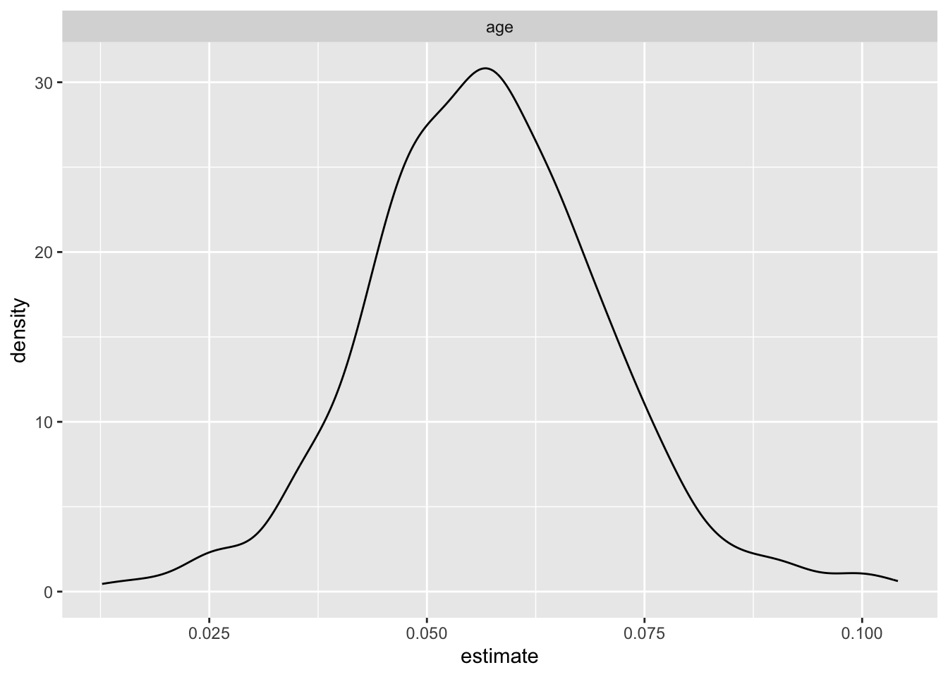
bootstrap_df|>
  filter(term != "age") |>
  ggplot(aes(x = estimate))+
  geom_density() +
  facet_wrap(.~ term)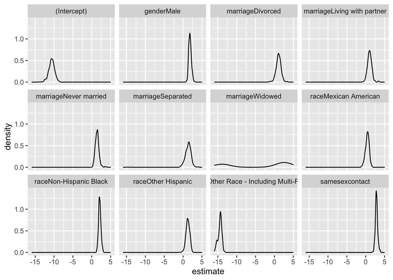
- This is the uncertainty that we would get in this dataset if we do repeated sampling
Bootstrap mean OR and 95% CI
bootstrap_df|>
  summarize(
    mean_OR = mean(OR),
    CI_lower = quantile(OR, 0.025),
    CI_upper = quantile(OR, 0.975)
    )|>
knitr::kable(digits = 3)| term | mean_OR | CI_lower | CI_upper |
|---|---|---|---|
| (Intercept) | 0.000 | 0.000 | 0.000 |
| age | 1.059 | 1.029 | 1.089 |
| genderMale | 6.706 | 3.436 | 13.385 |
| marriageDivorced | 3.779 | 0.825 | 10.311 |
| marriageLiving with partner | 3.464 | 0.987 | 8.563 |
| marriageNever married | 4.769 | 1.682 | 11.771 |
| marriageSeparated | 5.055 | 0.769 | 13.984 |
| marriageWidowed | 11.406 | 0.000 | 55.758 |
| raceMexican American | 1.702 | 0.508 | 3.793 |
| raceNon-Hispanic Black | 8.696 | 4.576 | 16.653 |
| raceOther Hispanic | 3.947 | 1.303 | 8.624 |
| raceOther Race - Including Multi-Racial | 0.000 | 0.000 | 0.000 |
| samesexcontact | 18.287 | 9.580 | 34.167 |
Bootstrap Confidence Intervals:
- The bootstrap analysis yields informative insights into the
association between various sociodemographic factors and HIV outcomes.
- Notably, the wide 95% confidence intervals (CI) for most variables, excluding age, suggest substantial uncertainty in the estimated odds ratios. Same-sex behavior stands out with a mean odds ratio of 18.499 and a relatively narrow CI (10.862 to 31.096), indicating a robust positive association with HIV risk.
- In contrast, factors like “Male” “Divorced” “Living with partner” “Never married” “Separated” “Widowed” “Mexican American” “Non-Hispanic Black” and “Other Hispanic” exhibit wide CIs, signifying considerable variability in their associations with HIV.
- The broad 95% CI underscores the uncertainty in the magnitude of these associations and suggests a need for caution in drawing definitive conclusions. This may be attributed to sample variability or other unaccounted factors influencing the observed relationships.
Conclusion
The logistic regression and bootstrap analyses indicate that several demographic factors are associated with HIV outcomes, same-sex behavior showing a particularly strong positive association. However, the wide 95% confidence intervals for most variables, excluding age, show significant uncertainty in the estimated odds ratios, highlighting the limitations of the study. These broad intervals may stem from sample variability or unaccounted confounders, necessitating caution in drawing definitive conclusions.
Therefore, future research should explore larger and more diverse datasets to enhance the generalizability of findings and address potential sources of variability. Additionally, a thorough investigation into the complex interplay between demographic variables and HIV risk, considering potential interactions and subgroup analyses, could provide a more nuanced understanding of these associations. Moreover, the study could benefit from incorporating behavioral and contextual factors that might contribute to HIV risk.