HIV/AIDS Surveillance Data Analysis across Countries
2023-12-09
About Data Source
The United States Census HIV/AIDS Surveillance Data Base contains information for all countries and areas of the world with at least 5,000 population, with the exception of Northern America (including the United States) and U.S. territories. Data included in the Data Base are drawn from medical and scientific journals, professional papers, official statistics, State Department cables, newspapers, magazines, materials from the World Health Organization, conference abstracts, and the Internet. Sources are scanned and reviewed for data.
Study Objective
The primary objective of this study is to elucidate the temporal dynamics and influential factors affecting HIV incidence rates on a global scale, with a particular focus on diverse sub-populations and geographic regions. We aim to achieve this by conducting a time-series analysis to identify significant trends, patterns, and associations. Specifically, our analysis leverages ARIMA modeling to investigate time-dependent trends thereby informing targeted public health strategies. The study places a special emphasis on Sub-Saharan Africa, where preliminary findings indicate a general decline in incidence rates among key sub-populations, such as sex workers, since the early 1990s. By dissecting these trends across varying income groups and regions, we seek to prioritize interventions and allocate resources more effectively in the global fight against HIV.
Data Cleaning and Preparation
library(tidyverse) # for data cleaning and manipulation
library(forecast)  # for ARIMA models
library(broom)     # for tidying model outputs and visualization
library(plotly)    # for interactive visualization
Since the dataset has inconsistency in sample size (some come with a
sample size and some come without), we assigned the median value to
those without sample size so that they could be included in the study
without significantly influencing the sample size variable.
Since the Data Base includes data from all countries worldwide with
5000+ population, we utilized an external country classification dataset
from the World
Bank to categorize the Data Base for analysis purposes.
incidence <- read.csv("surveillance/data/hiv_incidence.csv") |>
  mutate(
    # Replace missing INC_RATE with 0 or other appropriate value
    INC_RATE = replace(INC_RATE, is.na(INC_RATE), 0),
    # Replace missing SAMPSIZE with median or other appropriate value
    SAMPSIZE = as.numeric(SAMPSIZE),
    SAMPSIZE = replace(SAMPSIZE, is.na(SAMPSIZE), median(SAMPSIZE, na.rm = TRUE))
  )

country_info <- readxl::read_excel("surveillance/CLASS.xlsx", sheet = "List of economies", col_names = TRUE)

incidence_grouped <- left_join(incidence, country_info, by = c("Country.Code" = "Code")) |>
  janitor::clean_names()

categorize_decade <- function(year) {
  paste0(substr(year, 1, 3), "0s")
}

incidence_grouped <- incidence_grouped |>
  mutate(decade = sapply(year, categorize_decade))
Analysis
Analysis Plan Flowchart
Data Preperation
To prepare the dataset for trend analysis, we first ensure all case counts are numerical and then rectify any data inaccuracies by substituting missing or placeholder values with zeros. Next, we organize the data by continental regions, income groups, and decade intervals, which allows us to compute average HIV incidence rates and total case counts within these categories. Similarly, we categorize the data by specific population subgroups to identify and quantify HIV trends within those demographics.
# For trend analysis involving region (continental), income_group (i.e., high-income, low-income, middle-income countries), and decade (1980s, 1990s, 2000s, 2010s, 2020s).
trend_continental <- incidence_grouped |>
  # Convert 'no_cases' to numeric (if it's not already)
  mutate(no_cases = as.numeric(no_cases)) |>
  # -1 is a placeholder in the no_cases and no_deaths column for NA. Replace -1 with 0 here.
  mutate(no_cases = ifelse(no_cases == -1, 0, no_cases)) |>
  # Group and summarize data by region, income_group, and decade
  group_by(region, income_group, decade) |>
  summarize(
    avg_inc_rate = mean(inc_rate, na.rm = TRUE),
    total_cases = sum(no_cases, na.rm = TRUE),
    .groups = 'drop'  # to drop grouping structure after summarization
  )

# For trend analysis involving population subgroup, e.g., MSM, IVDU, Transgender individuals, etc.
trend_subgroup <- incidence_grouped |>
  # Convert 'no_cases' to numeric (if it's not already)
  mutate(no_cases = as.numeric(no_cases)) |>
  # -1 is a placeholder in the no_cases and no_deaths column for NA. Replace -1 with 0 here.
  mutate(no_cases = ifelse(no_cases == -1, 0, no_cases)) |>
  # Group and summarize data by population subgroup
  group_by(population_subgroup) |>
  summarize(
    avg_inc_rate = mean(inc_rate, na.rm = TRUE),
    total_cases = sum(no_cases, na.rm = TRUE),
    .groups = 'drop'  # to drop grouping structure after summarization
  )
Exploratory Data Analysis (EDA)
- Incidence map
- we showed HIV incidence by country.
# A map reports the HIV incidence rates in each country
map_inc = incidence_grouped |>
  plot_ly(type = 'choropleth', locations = ~country_code,
               z = ~inc_rate, text = ~paste(country, ': ', inc_rate, '%'),
               hoverinfo = 'text',color = ~inc_rate, colors = "Reds") |>
  layout(title = 'HIV Incidence Rates by country',
         geo = list(projection = list(type = 'orthographic')))

map_inc
Regions such as the Middle East, Sub-Saharan Africa, and South Asia demonstrate relatively higher HIV incidence rates compared to other areas. It is important to consider that regions depicted with no or minimal HIV incidence rates might not necessarily indicate a true low prevalence; this could be attributed to insufficient research or underreporting in those regions. Additionally, the database from which this map is generated does not include data from North American countries, hence their HIV incidence rates are not represented in this visualization.
- Heatmap for Incidence Rate by Region, Decade, and National Income Level
- we categorized data by their continental region, their studied country’s national income level, and decade of which the study is done. We produced a heatmap for reported HIV incidence rate grouped by these categories.
trend_continental <- trend_continental |>
  mutate(avg_inc_rate = as.numeric(avg_inc_rate))

heatmap_plot <- trend_continental |>
  ggplot(aes(x = decade, y = region, fill = avg_inc_rate)) +
  geom_tile(color = "white") +
  scale_fill_gradient(low = "white", high = "red") +
  facet_wrap(~income_group) +
  theme_minimal() +
  theme(
    axis.text.x = element_text(angle = 45, hjust = 1),
    axis.title = element_text(size = 12),
    legend.title = element_text(size = 10)
  ) +
  labs(
    title = "Heatmap of HIV Incidence Rate by Region, Decade, and Income Level",
    x = "Decade",
    y = "Region",
    fill = "Avg Inc Rate"
  )

print(heatmap_plot)
High, Upper middle income, and Lower middle income regions in Europe and Central Asia has the highest average incidence rate during 2000s and 2010s, followed by High income regions in Middle East & North Africa during 1990s and Lower middle income regions in South Asia during 2020s. Sub-Saharan Africa shows consistently higher incidence rates across all income levels and decades.
- Bar Plot for Total Cases by Population Subgroup
we recoded the population subgroup according to the codebook on website(https://www2.census.gov/programs-surveys/international-programs/guidance/user-guide/HIV_AIDSGeneralTerms.pdf).
Population Subgroups:
Children: Includes all children except for those who are patients with tuberculosis or transfusion recipients.Intravenous Drug Users/Needle Sharers: Includes drug addicts.Military/Armed Forces: Includes police forces.Other Non-Representative: Includes high-risk individuals such as transgender individuals, and clients of sex workers who do not fall into any of the other subpopulations.Other Patients: Includes all other patients except for pediatric patients, STI patients, TB patients, and Transfused patients.Sex workers: Includes other highly sexually active women such as bar workers.Two Known Mixed Groups: Includes two different subpopulations reported with one number. An example one number represents both pregnant women and TB patients.
We produced a barchart for reported number of HIV cases grouped by these recoded subgroups. I excluded those of general population not in this six categories.
## recode subpopulation
trend_subgroup = trend_subgroup |>
  mutate(
    subpop_pooled = ifelse(
     str_detect(population_subgroup, "(?i)police|military"), "Military/Armed Forces",
     ifelse(
       str_detect(population_subgroup, "(?i)child|pediatric"), "Children",
     ifelse(
       str_detect(population_subgroup, "(?i)drug|IVDU") & !str_detect(population_subgroup, "(?i)STI|homo|prisoner|partner|sex worker"),  "Intravenous Drug Users/Needle Sharers",
     ifelse(
       str_detect(population_subgroup, "(?i)sex worker|bar") & !str_detect(population_subgroup,"(?i)trans|IVDU|homo|MSM|drug|client"),"Sex workers",
     ifelse(
       str_detect(population_subgroup, "(?i)transgender|homo|MSM|gay|TB|STI|sexually|prisoner|infants born|HIV2+|high risk|of HIV") & !str_detect(population_subgroup, "(?i)sex worker|IVDU|drug|Testing center attendees"), "Other Non-Representative",
      ifelse(
       str_detect(population_subgroup, "(?i)pts.|pregnant|Mothers") & !str_detect(population_subgroup, "(?i)sex worker|IVDU|STI|homo|TB"), "Other Patients",
      ifelse(
       str_detect(population_subgroup, "(?i)Blood|port|Testing center attendees|employer|contractor|textile|Wives|HIV-") , "General Population","Two Known Mixed Groups"))))))))

# unique(incidence$population_subgroup[str_detect(incidence$population_subgroup,"patient")]) for categorization
# unique(incidence$population_subgroup[incidence$population_subgroup_pooled=="Two Known Mixed Groups"])
trend_subgroup = trend_subgroup |>
  mutate(subpop_pooled = ifelse(
    population_subgroup %in% c("Bisexuals","Clients of sex workers","High risk individuals","Partners of drug users","Blood transfusion recipients"),"Other Non-Representative",subpop_pooled),
    subpop_pooled = ifelse(
      population_subgroup == "Sex workers & clients","Sex workers",subpop_pooled),
    subpop_pooled = ifelse(
      population_subgroup == "Patients","Other Patients",subpop_pooled),
    subpop_pooled = ifelse(
      population_subgroup %in% c("Heterosexuals","Adults","Individuals","Women","Various groups","Residents","Unspecified population","Truck drivers","Others","Adults - circumcised","Adults - uncircumcised","Factory workers", "General population", "Low risk groups","Fishermen","Workers","Esquineros","Trucking companies employees","Youths","Hospitality girls","Adolescents","Volunteers","Controls","Rural population","Employees","Commercial bank employees"),"General Population",subpop_pooled))


check=trend_subgroup |>
  filter(subpop_pooled != "Two Known Mixed Groups") |>
  group_by(subpop_pooled,population_subgroup) |>
  summarise(n=n())


trend_subgroup |>
  filter(subpop_pooled != 'General Population')|>
  group_by(subpop_pooled) |>
  summarise(total = sum(total_cases))|>
  mutate(subpop_pooled = fct_reorder(subpop_pooled,total)) |>
  ggplot(aes(y = subpop_pooled, x = total, fill = subpop_pooled)) +
  geom_bar(stat = "identity") +
  theme_minimal() +
  labs(title = "Total HIV Cases by Population Subgroup",
       y = "Population Subgroup",
       x = "Total Cases") +
  theme(axis.text.y = element_text(size = 5, angle = 0),
        legend.position = "none")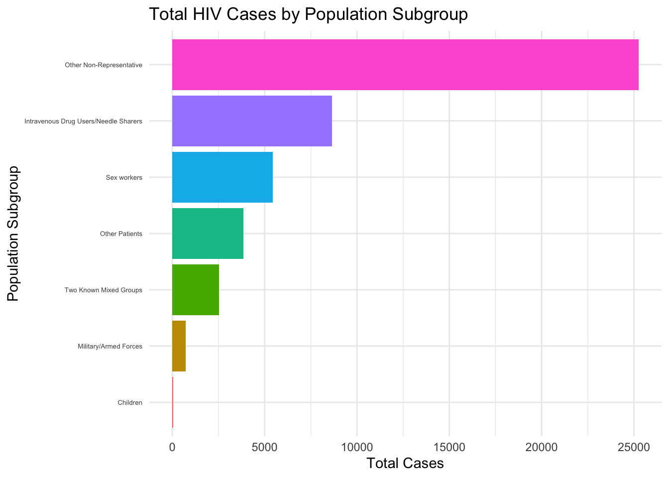
This horizontal bar chart displays the distribution of total HIV cases by different population subgroups, with “Other Non-Representative” having the highest count and “Children” having the lowest.
Time-Series Analysis: ARIMA Model
Time series analysis is appropriate for examining how data points indexed in time order (like yearly HIV incidence rates) change over time. It is suitable for analyzing trends, seasonal patterns, or forecasting future values. Since we wanted to assess HIV incidence rates by year, time series analysis is a good match.
Data Preparation
To lay the groundwork for our analysis, we arrange our dataset in chronological order to observe the progression of HIV cases over time. We then standardize the case numbers, ensuring they’re all in numerical form and address any missing values by replacing placeholders with zeroes. Following this, we structure the dataset in a granular fashion, with each record representing a unique combination of year, region, income group, and population subgroup. For each of these specific intersections, we calculate the mean incidence rate of HIV and the sum of cases. This methodical organization of data is designed to facilitate an in-depth analysis of HIV trends, allowing us to examine the evolution and patterns of the disease across different regions, economic strata, and demographic groups year by year.
sorted_data <- incidence_grouped |>
  arrange(year) |>
  # Convert 'no_cases' to numeric (if it's not already)
  mutate(no_cases = as.numeric(no_cases)) |>
  # -1 is a placeholder in the no_cases and no_deaths column for NA. Replace -1 with 0 here.
  mutate(no_cases = ifelse(no_cases == -1, 0, no_cases))

# Transform the dataset to have one observation per time point per subgroup
grouped_data <- sorted_data |>
  group_by(year, region, income_group, population_subgroup) |>
  summarize(
    mean_inc_rate = mean(inc_rate, na.rm = TRUE),
    sum_no_cases = sum(no_cases, na.rm = TRUE),
    .groups = 'drop'  # This ensures the resulting tibble is not grouped
  )
Model Building
library(forecast)
library(tseries)
library(purrr)


# Create a list of unique combinations of region, income_group, and population_subgroup
unique_combinations <- grouped_data |>
  distinct(region, income_group, population_subgroup)

# Function to perform time series analysis on a subset of data
perform_time_series_analysis <- function(subset_data) {
  if (length(subset_data$mean_inc_rate) < 50) {
    warning(paste("Not enough data points to fit ARIMA model for", unique(subset_data$region), unique(subset_data$income_group), unique(subset_data$population_subgroup)))
    return(NULL)
  }

  ts_data <- ts(subset_data$mean_inc_rate, start = min(subset_data$year), frequency = 1)

  # Check for stationarity
  adf_test <- adf.test(ts_data, alternative = "stationary")

  # Fit ARIMA model
  arima_model <- auto.arima(ts_data)

  # Diagnostics
  diagnostics <- list(
    checkresiduals(arima_model, plot = FALSE)
  )

  # Return the results
  return(list(arima_model = arima_model, adf_test = adf_test, diagnostics = diagnostics))
}

# Modify the threshold here
threshold <- 20  # or another number that makes sense for your data

# List to store results
time_series_results <- list()

# Loop over each unique combination
for(i in seq_len(nrow(unique_combinations))) {
  # Filter the data for the current combination
  current_data <- grouped_data |>
    filter(
      region == unique_combinations$region[i],
      income_group == unique_combinations$income_group[i],
      population_subgroup == unique_combinations$population_subgroup[i]
    )

  # Perform time series analysis if data points are above the threshold
  if (nrow(current_data) >= threshold) {
    ts_data <- ts(current_data$mean_inc_rate, start = min(current_data$year), frequency = 1)

    # Check for stationarity
    adf_test <- adf.test(ts_data, alternative = "stationary")

    # Fit ARIMA model
    arima_model <- auto.arima(ts_data)

    # Diagnostics
    diagnostics <- list(
      checkresiduals(arima_model, plot = FALSE)
    )

    # Store the result with a unique name
    time_series_results[[paste(unique_combinations$region[i], unique_combinations$income_group[i], unique_combinations$population_subgroup[i], sep = "_")]] <- list(arima_model = arima_model, adf_test = adf_test, diagnostics = diagnostics)
  } else {
    warning(paste("Not enough data points to fit ARIMA model for combination", i, ":", unique_combinations$region[i], unique_combinations$income_group[i], unique_combinations$population_subgroup[i]))
  }
}
##
## Ljung-Box test
##
## data: Residuals from ARIMA(0,1,2) with drift
## Q* = 8.4892, df = 3, p-value = 0.03691
##
## Model df: 2. Total lags used: 5# Check how many models were successfully fitted
length(time_series_results)## [1] 1# View results if any models were fitted
if (length(time_series_results) > 0) {
time_series_results
} ## $`Sub-Saharan Africa_Lower middle income_Sex workers`
## $`Sub-Saharan Africa_Lower middle income_Sex workers`$arima_model
## Series: ts_data
## ARIMA(0,1,2) with drift
##
## Coefficients:
## ma1 ma2 drift
## -1.5900 0.9355 -1.0622
## s.e. 0.4624 0.5196 0.5354
##
## sigma^2 = 70.67: log likelihood = -89.56
## AIC=187.12 AICc=189.12 BIC=192
##
## $`Sub-Saharan Africa_Lower middle income_Sex workers`$adf_test
##
## Augmented Dickey-Fuller Test
##
## data: ts_data
## Dickey-Fuller = -3.0323, Lag order = 2, p-value = 0.1791
## alternative hypothesis: stationary
##
##
## $`Sub-Saharan Africa_Lower middle income_Sex workers`$diagnostics
## $`Sub-Saharan Africa_Lower middle income_Sex workers`$diagnostics[[1]]
##
## Ljung-Box test
##
## data: Residuals from ARIMA(0,1,2) with drift
## Q* = 8.4892, df = 3, p-value = 0.03691Results
ARIMA Model:
- Model Type: ARIMA(0,1,2) with drift indicates that the model is an ARIMA model with no autoregressive terms (p=0), one differencing (d=1 to make the series stationary), and two moving average terms (q=2).
- Coefficients:
ma1: The first moving average coefficient is -1.5900, with a standard error of 0.4624. This is a significant coefficient given the magnitude compared to its standard error.ma2: The second moving average coefficient is 0.9355, with a standard error of 0.5196. This coefficient is also significant.drift: The coefficient for the drift term is -1.0622, with a standard error of 0.5354. This suggests a downward trend in the series.
- Model Fit:
sigma^2: The estimated variance of the residuals is 70.67.log likelihood: The log-likelihood of the model is -89.56, which is used to calculate AIC and BIC.AIC,AICc,BIC: These are information criteria used to compare models, with lower values generally indicating a better fit. The AICc is an adjusted version of the AIC for small sample sizes.
- Augmented Dickey-Fuller Test:
- This test checks for the presence of unit roots, which are a sign of non-stationarity in the time series.
- The Dickey-Fuller value is -3.0323 with a p-value of 0.1791. Since the p-value is greater than the common significance level of 0.05, the test does not reject the null hypothesis of a unit root being present, suggesting that the time series may not be stationary despite the differencing.
- Ljung-Box Test:
- This test is used to determine if there are significant autocorrelations in the residuals at lag k. Ideally, we want the p-value to be above 0.05 to conclude that there are no significant autocorrelations.
- The test statistic is Q* = 8.4892 with a p-value of 0.03691. Since the p-value is less than 0.05, this suggests that there is evidence of significant autocorrelation at lag k within the residuals, which means the model may not be adequately capturing all the patterns in the data.
Interpretations of results
- The ARIMA model suggests a decreasing trend in the incidence rates for the subgroup.
- The ADF test suggests that the series may not be completely stationary, indicating that further differencing or a different model specification may be necessary.
- The significant Ljung-Box test implies that there are autocorrelations in the residuals that the model is not capturing, which could mean that important predictors or higher-order lags might be missing from the model. Given the limited information on the Data Base we are using, we are unable to progress further. However, future research may consider incorporating other predictors for the model.
Model Diagnosis and Time Series Trend Visualization
1. Select which model/combination to visualize
# Loop through the results and print the summary of each ARIMA model
for (combination in names(time_series_results)) {
cat("\nCombination:", combination, "\n")
print(summary(time_series_results[[combination]]$arima_model))
}##
## Combination: Sub-Saharan Africa_Lower middle income_Sex workers
## Series: ts_data
## ARIMA(0,1,2) with drift
##
## Coefficients:
## ma1 ma2 drift
## -1.5900 0.9355 -1.0622
## s.e. 0.4624 0.5196 0.5354
##
## sigma^2 = 70.67: log likelihood = -89.56
## AIC=187.12 AICc=189.12 BIC=192
##
## Training set error measures:
## ME RMSE MAE MPE MAPE MASE ACF1
## Training set -0.6193829 7.732668 5.426826 1.645182 139.093 0.7643619 0.4777973Based on the summary of the ARIMA model for the combination “Sub-Saharan Africa_Lower middle income_Sex workers,” it looks like an interesting case to visualize. The ARIMA(0,1,2) model with drift indicates that the time series is differenced once (to make it stationary) and includes two moving average terms. The drift term suggests a linear trend over time.
2. Time Series Trend Visualization
# Extracting the data and model for "Sub-Saharan Africa_Lower middle income_Sex workers"
selected_model <- time_series_results[["Sub-Saharan Africa_Lower middle income_Sex workers"]]$arima_model
selected_data <- grouped_data %>%
filter(
region == "Sub-Saharan Africa",
income_group == "Lower middle income",
population_subgroup == "Sex workers"
)
# Plotting the actual time series data and the fitted model
ggplot(selected_data, aes(x = year, y = mean_inc_rate)) +
geom_line() +
geom_line(aes(y = fitted(selected_model)), color = "red") +
labs(title = "Time Series Trend and ARIMA Model for Sub-Saharan Africa, Lower Middle Income, Sex Workers",
x = "Year",
y = "Mean Incidence Rate") +
theme_minimal()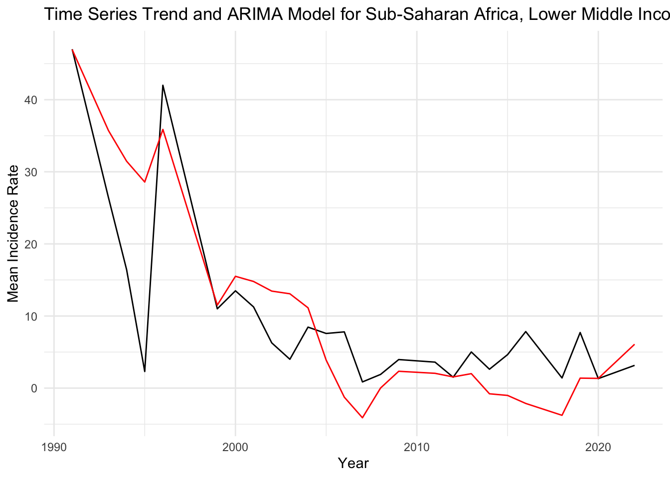
Black Line (Actual Data): Represents the actual observed values of the mean incidence rate over time. This line shows the fluctuations in the data across years.
Red Line (Fitted ARIMA Model): Represents the values as fitted by the ARIMA model. The red line seems to follow the general downward trend of the actual data, indicating that the model is capturing the overall trend well.
Interpretation of Trend: There is a notable decrease in the mean incidence rate from the early 1990s, which then stabilizes into a more fluctuating pattern from the 2000s onwards. The red line (fitted values) is capturing this trend, suggesting that the ARIMA model is accounting for the major trend in the data.
3. Diagnostic Plots for the ARIMA Model
# Diagnostic plots for the ARIMA model of the selected combination
checkresiduals(selected_model)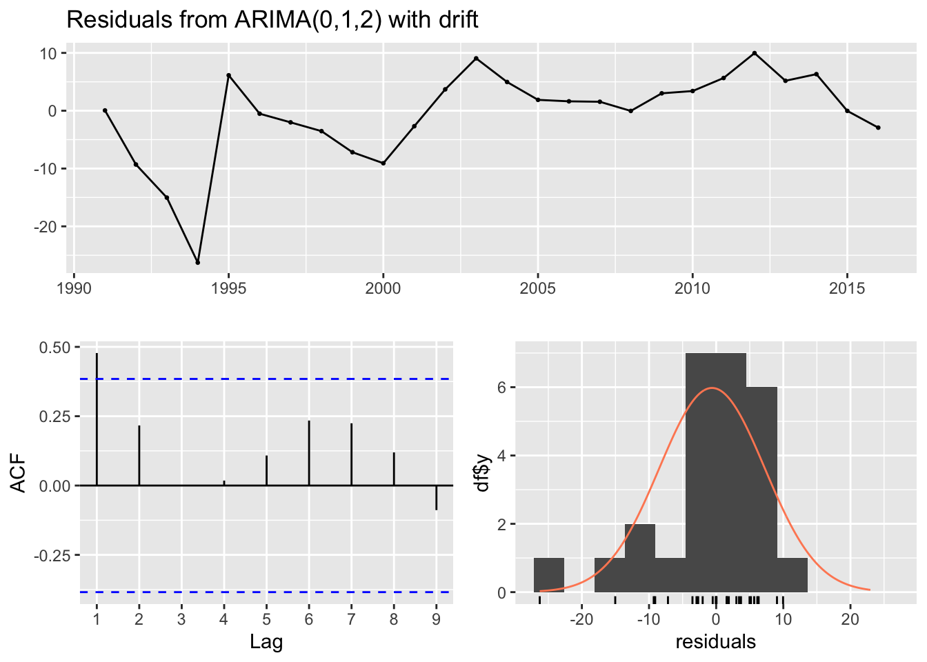
##
##  Ljung-Box test
##
## data:  Residuals from ARIMA(0,1,2) with drift
## Q* = 8.4892, df = 3, p-value = 0.03691
##
## Model df: 2. Total lags used: 5Top Plot (Residuals vs. Time): This plot shows the residuals of the model over time. Ideally, the residuals should be randomly scattered around zero, indicating that the model has captured most of the trend and seasonality. In your graph, residuals do not show any clear pattern over time, which is good, but there seem to be certain years with higher deviations from zero, which could indicate model misspecification or the presence of outliers/anomalies.
Bottom Left Plot (ACF of Residuals): This plot shows the autocorrelations of the residuals at different lags. Ideally, we want to see these autocorrelations fall within the blue dashed lines, which represent the confidence intervals. If they are within the blue lines, it suggests that there is no significant autocorrelation in the residuals, and the model has captured the time series’ structure well. Our plot shows some autocorrelations at different lags crossing the confidence bounds, which might suggest that the model could be improved to better capture the time series dynamics.
Bottom Right Plot (Histogram and Q-Q Plot of Residuals): The histogram with the overlaid density plot and the Q-Q plot assess the normality of the residuals. The histogram seems to show that residuals may be normally distributed, but the Q-Q plot indicates some deviations from normality, particularly in the tails. This suggests that the residuals have some heavier tails than the normal distribution, which can occur if there are outliers or extreme values in our data.
Conclusion
The study has identified meaningful patterns in the incidence rates of HIV among various subgroups in Sub-Saharan Africa. The time series analysis, particularly the ARIMA(0,1,2) model with drift, has captured a notable decreasing trend in HIV incidence rates since the early 1990s. This trend stabilizes somewhat in the 2000s, with some fluctuation, but does not show a significant increase, indicating a potential effectiveness of interventions and awareness over time. Diagnostic plots suggest that while the model fits well overall, there are indications of outliers or anomalous events that could be affecting the residuals, pointing to areas where the model could be refined.
The overall conclusion is that HIV incidence rates in Sub-Saharan Africa show a decreasing trend over the years among sex workers, with some variability that might be explained by regional and economic factors. The analysis underscores the importance of tailored public health interventions and the need for continuous monitoring and adaptation to sustain and enhance the progress made in HIV prevention and treatment.